We see type every day, yet often don’t pay attention to or appreciate what goes into its actual design. In truth, there is just as much thought and creativity that goes into the look of a typeface or its implementation in presenting content as there is in an image-based composition or illustration. The design of a typeface can have a dramatic effect on the way a message is delivered—either enhancing its tone and emotional impact or diminishing it.
Here are several terms and concepts that are integral to type design and can be useful to know the next time you’re at a party and find yourself in a conversation with a designer.
Glyph
A glyph is the basic building block of type. It’s an elemental symbol that, free of any design application, collectively adds up to our system of communication. The alphabet, numbers, and punctuation are examples of glyphs.
Aperture
This is a small opening within a glyph—for example, the letter “e” has an aperture. Widening or narrowing the size of the aperture often has a direct effect on a letter’s legibility. Of course, this also impacts readability when the letter is used within a word and sentence.
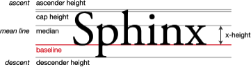
x-height
The x-height refers to the distance between the baseline and the mean line in a typeface. It is measured by the height of the lowercase x in a font system (which is where the term comes from). While the letter x is the reference for this measurement, the letters a, c, e, m, n, o, r, s, u, v, w, and z will work as well.
Typefaces with a tall x-height tend to be easier to read at smaller point sizes. The ratio of the x-height to the overall body height is one of the major characteristics that defines the appearance of a typeface. If a typeface looks too wide, it might not be the weight of the font; it might just be the x-height.
Ascender
This is the part of a lowercase letterform that rises above the x-height of a type family, as seen in l, k, b, and d. Ascenders are important for easing prolonged reading; however care must be given to the height. Too much ascender-height, combined with not enough x-height, can actually create additional strain when reading.
Descender
Descenders are the part of a letterform that falls below the baseline. In lowercase terms, this applies to p, y, g, and q.
Hierarchy
If all type was the same size, it would be near-impossible to know what information on a page or screen is most important. As the amount of information you present increases, the greater the challenge you have in guiding the reader to follow the content in the right order. A typographic hierarchy is a system that provides a structured form of content emphasis, providing visual cues of where to enter and exit, and what should be read first, next, and last.
A typical hierarchy is defined by different cues, with size variation being the most common cue. In other words, headings are large, subheads smaller, and body type smaller still. However, size isn’t always the only cue for hierarchy identification—it can also be achieved with color, spacing, and weight.